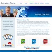
Skyrocket Your Opt-In Rates & Have a Proven and Complete Opt-In Process Set Up In 10 Minutes!
The Super Squeeze Page Pack is a package of fully formated templates, and all kinds of extras like graphics elements, to help you create and set up high converting squeeze pages, fast.
What makes this different from other similar products?
There is no shortage of other opt-in packs and products and templates out there. The problem with most of them is that they`re not created to actually increase the opt-ins. Just like most other template packages for anything else out there, they`re generic and don`t help to convert, but actually hurt converions in most cases.
1. Nice professional background effect that doesn`t distract from the sales copy, and also adds a professional touch. You can use ANY other background image that you have or any other background color (there`s also a selection of other backgrounds already created for you in this package).
2. Simple, clean and professional design with main focus being on sales copy. Again, the design doesn`t distract from the message of the sales copy, and these kind of simple designs are exactly the kind of squeeze pages that convert best.
3. Simple header image - you can replace it with your own header, if you do want to add some extra graphics to the page.
4. Left side area for main sales copy text to tell people why they should opt-in. All the text is already nicely formated for you, so you just type in your own sales copy here. There are sample sales copy bits that you can swipe, or use any of your own sales copy.
5. Big arrow graphic - makes the opt-in box stand out and guides the eye to the opt-in form. You can put any image of your own in that spot - like a cover of a free report - to show people what they get for free. That`s one of the places where you SHOULD have some kind of an image, to make the opt-in form stand out better, and maybe give a visual representation of what the person`s will get. I`m also including several other arrows and graphics for this spot as part of this package, so you`ll get a variety of different images to use if you don`t have your own.
6. Above the fold opt-in box area, nicely formated to stand out from the sales copy text, and with a matching color. The opt-in box expends and contracts so you can add more text or graphics in there, or take things away, without fussing around with the design in any way.
7. Pre-written call to action and instructions text - you can leave it as is to save time, or edit the text to say what ever you want. And you can write more text (since the opt-in box area expends)
8. Animated arrows pointing to the opt-in form, to make the opt-in form pop out even more. You don`t have to use this - just one image at the very top is enough - but I think it does help. You can use any other image here, or no image at all.
9. Opt-in form area that`s very easy to edit - just copy and paste your own opt-in form code (as is) into the appropriate area. No need to change the code in any way to make it "compatible" with the template. You can have an email only form, name and email form, or even a bigger form with lots of fields. And you can use any autoreponder like Awber, Getresponse, or any other.
10. Privacy text pre-written for you - you can edit the text to say what ever you want, but it`s already there and you can use it as is to save time.
11. Simple footer image - which you can replace with your own footer.
All of these things are already there for you, and are already formated nicely based on the best converting opt-in form design techniques. You can customize them and play around with them to tweak and test the page to get the best conversions. It`s a very flexible template and you can use it as is, or use it as the main starting point for any new squeeze pages you want to create.


